Visual Communication
The Power of Shared Understanding
The VC Blog is a new channel for fresh perspectives on design and the media landscape, as well as developments at Visual Capitalist. To visit the main site, click here.
Somewhere along the way we stopped spelling everything out.
The vast majority of adults in developed economies now carry a smartphone and we’re now more connected than at any other point in modern history. Digital communication is now peppered with visual shorthand in the form of emojis and gifs, and text-only navigation is becoming more of a rarity in the digital world. Today, iconography is doing the heavy lifting in a lot of the interfaces we use in everyday life.
A potent example of this visual shorthand in action is Instagram. The app, used by over one billion people every month, has completely dispensed with text on its home screen navigation.
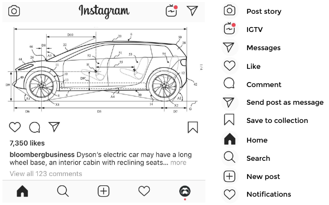
This isn’t a new development either. Instagram’s primary navigation has been completely wordless since about 2012.
Consider the hamburger menu (≡), a staple of just about every app and mobile-friendly website. Nobody explained that trio of horizontal lines to internet users. That symbol didn’t evolve over time from some universally understood term for navigation; people just figured it out.
The simple act of allowing users to “figure things out” may not seem particularly revolutionary, but it signals a broader shift in attitude by people producing interfaces and content. Rather than planning for the lowest common denominator, creators are assuming users will have a certain degree of digital savviness.
Brave New Visual World
Smartphones and social media haven’t just increased the volume of communication and information exposure. They’ve created new forms of shared understanding.
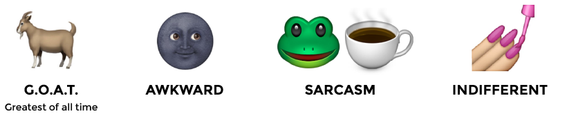
Anyone who has spent time on social media platforms knows that emojis are packed with meaning. Consider the examples below:
This shared understanding is what Visual Capitalist taps into during the design process. We understand that the majority of our audience does not require the crutch of extraneous labelling and over-explanation.
Here’s an example of what we mean. People who are familiar with the financial markets will likely be able to decipher the simple pictorial phrase below.

Did you guess ‘bear market’?
This type of visual comprehension is no accident. We’re hardwired to process visual content much faster than text. And out in the digital battlefield – social feeds, Google searches – we have a split second to win your attention.
Visual Shorthand in Action
Consider the example below. In late 2018, when the all five of the FAANG stocks officially dipped into bear territory, most media outlets were primarily focused on reporting the event in the way they know best, by writing about it. The way the actual data was displayed was almost an afterthought.
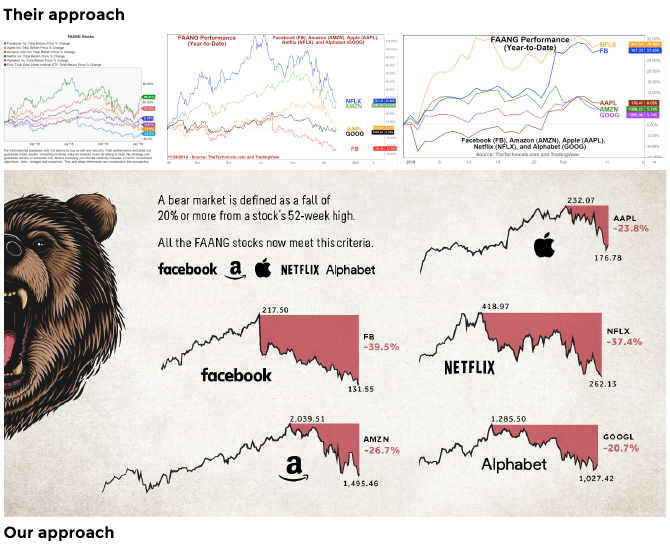
Remember how easy it was to decipher “bear market” from the earlier emoji example? Well, those same visual cues are at work in the graphic above.
Another example of making information easier to understand at a glance is this graphic charting global happiness.
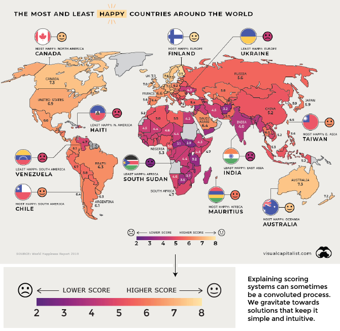
Smiley faces rarely need any explanation, so not only is this graphic faster to comprehend, it helps make the content more accessible to non-English speakers.
Cutting Through the Noise
According to IBM, 2.5 quintillion bytes of data are produced daily. Gleaning any sort of insight from the barrage of information we’re exposed to has become harder than ever.
That’s why tapping into the power of visual communication is so important, particularly when data is involved.
By using visual cues that tap into shared understanding or overtly highlighting the takeaway of a dataset, we can help make information more digestible.
The world is growing more complicated by the day. Let’s cut through the noise.